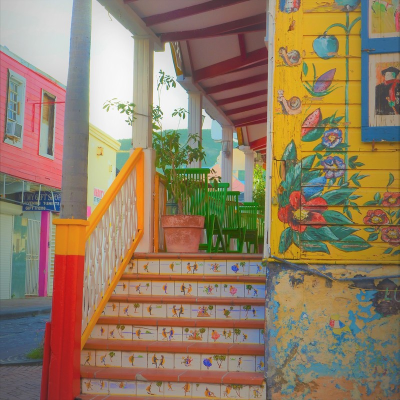
 I had the good fortune to travel to Sint Maarten this winter. One of the marvelous aspects of the island is its architecture. The very best example of the exuberant color used was this building in the center of Philipsburg on the Dutch side of the island. the entire structure was a piece of art, and a sight to behold. It was an inspiration...
0 Comments
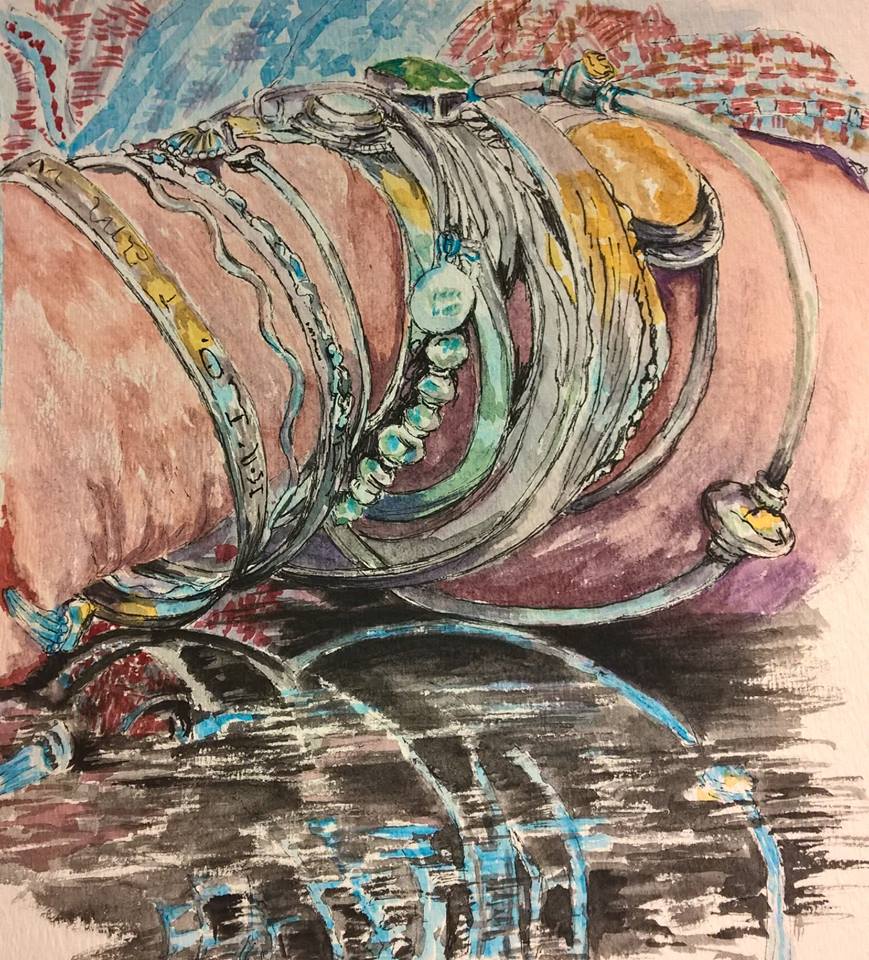 It really helps to do a color value sketch before doing a painting. This is a detail of bracelets for a larger portrait. I needed to practice the most detailed and difficult section of the painting before putting oil to canvas. The bracelets and their reflection I felt would give me the most trouble and I wanted to practice the reflection especially. Several sketches, value studies and color sketches help you concentrate on painting once you have the overall values, composition and difficult areas well regulated. I will work on the reflection again before I begin the oil painting and I will do an overall sketch of the entire portrait.
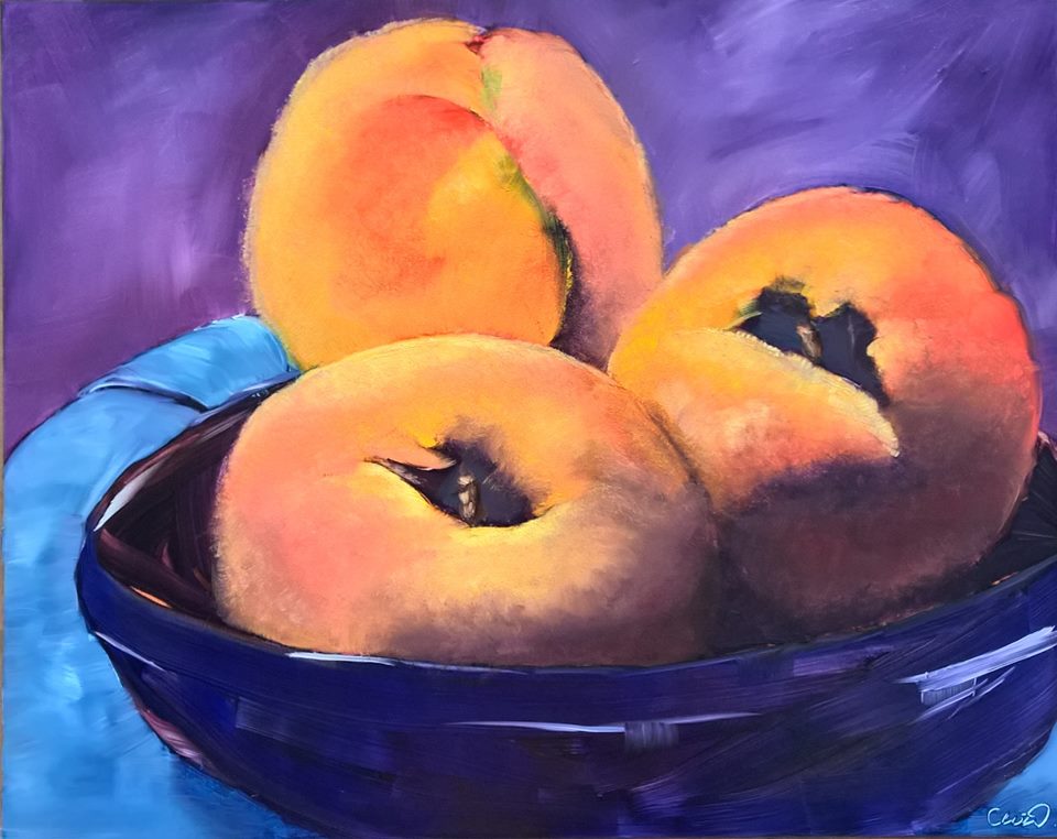
Alla Prima painting sketch of peaches. Alla Prima consists of three layers of oil paint: A quick composition sketch, a quick dark color layer and a top layer, all done at one sitting, while the paint is still wet. This is a fun activity using transparent paints on the second layer and a top layer of opaque paints. In this exercise I tried to use the under layer in the bowl as complete without covering it in opaque paint : hoping to give the painting a feeling of immediacy, The peaches were created using brush and paper towel for that light, fuzzy look to the peaches, The dark underlayer also can be seen in the core section. The napkin and the background are treated in a loose manner to contrast with the peaches. The color choice was using complementary colors of blue and orange and purple and yellow. * the photo used was by Rita Paradis and the painting created at a workshop with artist Rita Paradis.
|
Agnes WnukPhotography and fine arts. Archives
March 2018
Categories |

 RSS Feed
